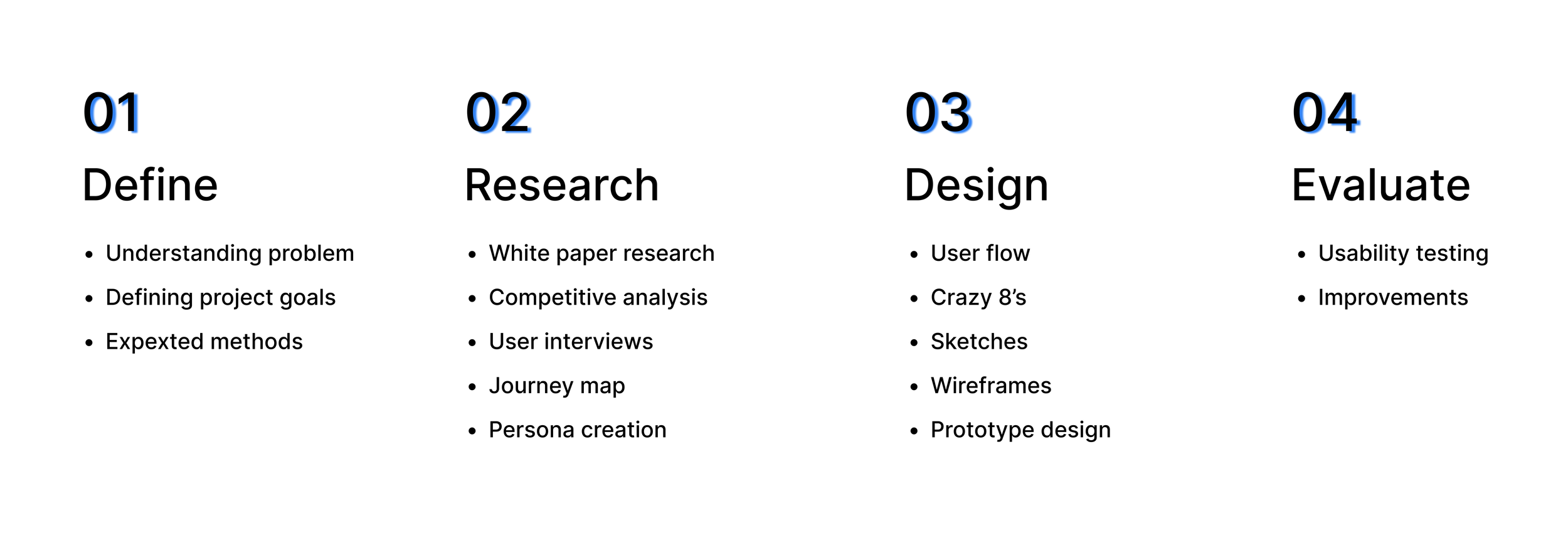
My Roles & Responsibilities
User Research: Competitive Analysis, User Interviews, Persona Mapping, Journey Mapping.
UX design: crazy 8’s, wireframing, prototyping
UI design + Interactions
Project context
March-May 2022
Solo project
Excessive waiting time before getting services at the hospital
PROBLEMI accompany my grandpa to the hospital and we are supposed to wait for a minimum of 2 hours to a maximum of 4 hours and this happens every time. This sparked the question - why can't I get live information on waiting time which can make my wait bearable?
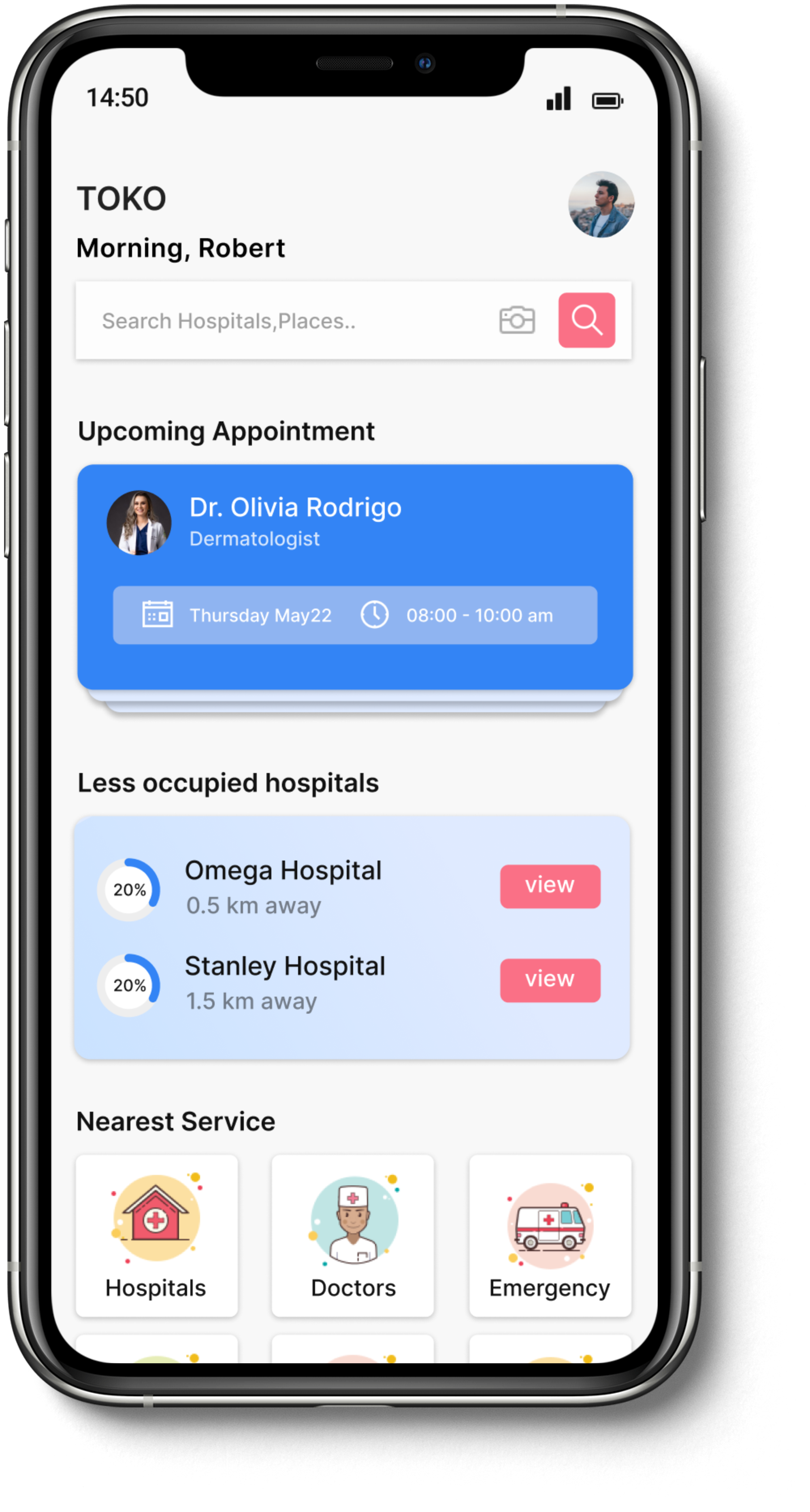
SOLUTIONAn app where patients can live-time track their turn to get service from the doctor, view the live count of patients ahead of them, set the remainder of their follow-up, and store all their prescriptions in one place.
Status tracking application
Displays time for your turn
Shows the expected wait time so you can catch up on work or run errands.
This reduces large gatherings in the waiting room which is safe for you during a pandemic.
Knowing the count of patients ahead of you
let you see your position in line at a glance.
giving information to make you feel that you are getting close
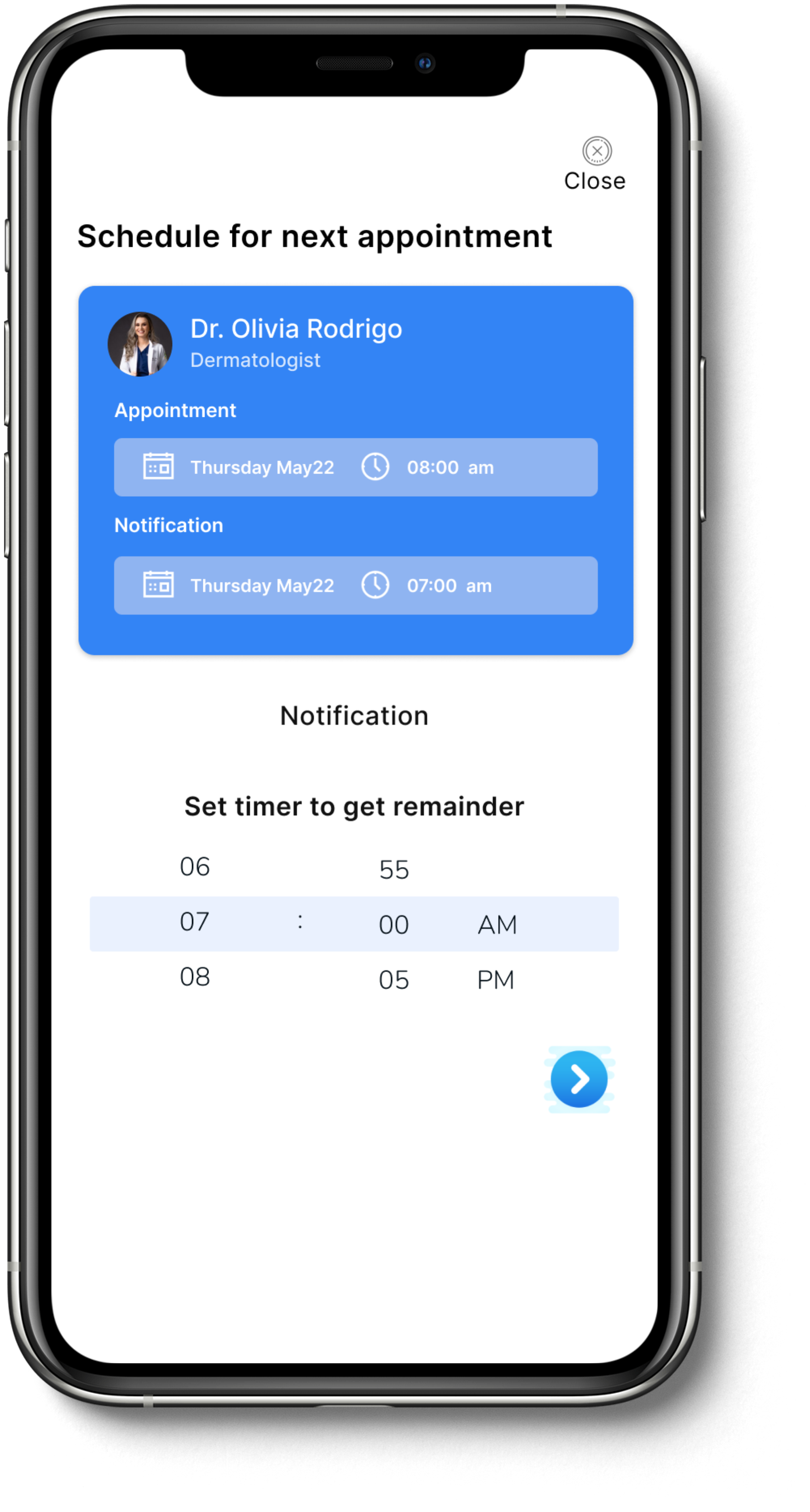
Set reminders for the follow-up and save prescriptions
get the remainder for your next follow-up appointment.
capture and save all your prescriptions in one place.
My Approach
White paper research
A way to make patients feel that they are getting closer…
So I started with white paper research, I began to search research articles on the topic of waiting time and its associated factors, the psychology of wait time, and the study of patient trust due to waiting time - when I stumbled upon these lines from ‘ Surprising thoughts about patient wait times’ by Kevin Pho, MD social media physician speaker:
Competitive analysis + the gap
None has the aspect of giving REAL-TIME status.
While keeping the above lines in mind I searched through popular apps. I found almost none of them had the aspect of giving information to patients during direct consultation which makes them feel like they are getting closer because information can make wait bearable. This became my opportunity for the solution.
User Interviews
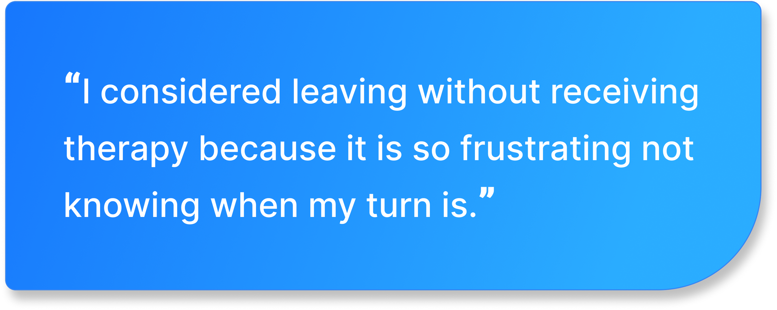
My interviewees said that they wasted their time and always thought of leaving without getting their service.
Even though I understood the importance of giving information through research, I’ve conducted interviews with seven people who visit the hospital often or always accompany elders. I asked them the questions below to find out how they feel about waiting time then organized my data through journey map.
When was the last time you visited the hospital?
How long do you spend in the waiting line?
What do you feel about waiting times?
Tell me a time when the wait was so long and how you felt about it.
Your thoughts on getting updates on waiting time while you wait
RESEARCH QUESTIONS:
- 30 yrs old working engineer
- 20 yrs old College Student
The main insight
Giving information is needed to make their wait bearable and to save their time.
Since waiting time also impacts trust, providing the information is necessary. then based on the journey map below, I found new opportunities for my design.
User Persona
PROBLEMUser Flow
Understanding the different pain points from research and interviews, I developed the path taken by the user in TOKO which takes them from their entry point through a set of steps towards a successful outcome and final action.
IDEATIONCrazy 8’s
I decided to use the crazy 8's technique to generate higher-level design concepts rapidly without giving much thought to design patterns. I spent a minute on each wireframe while referring to findings from all research approaches.
Wireframes
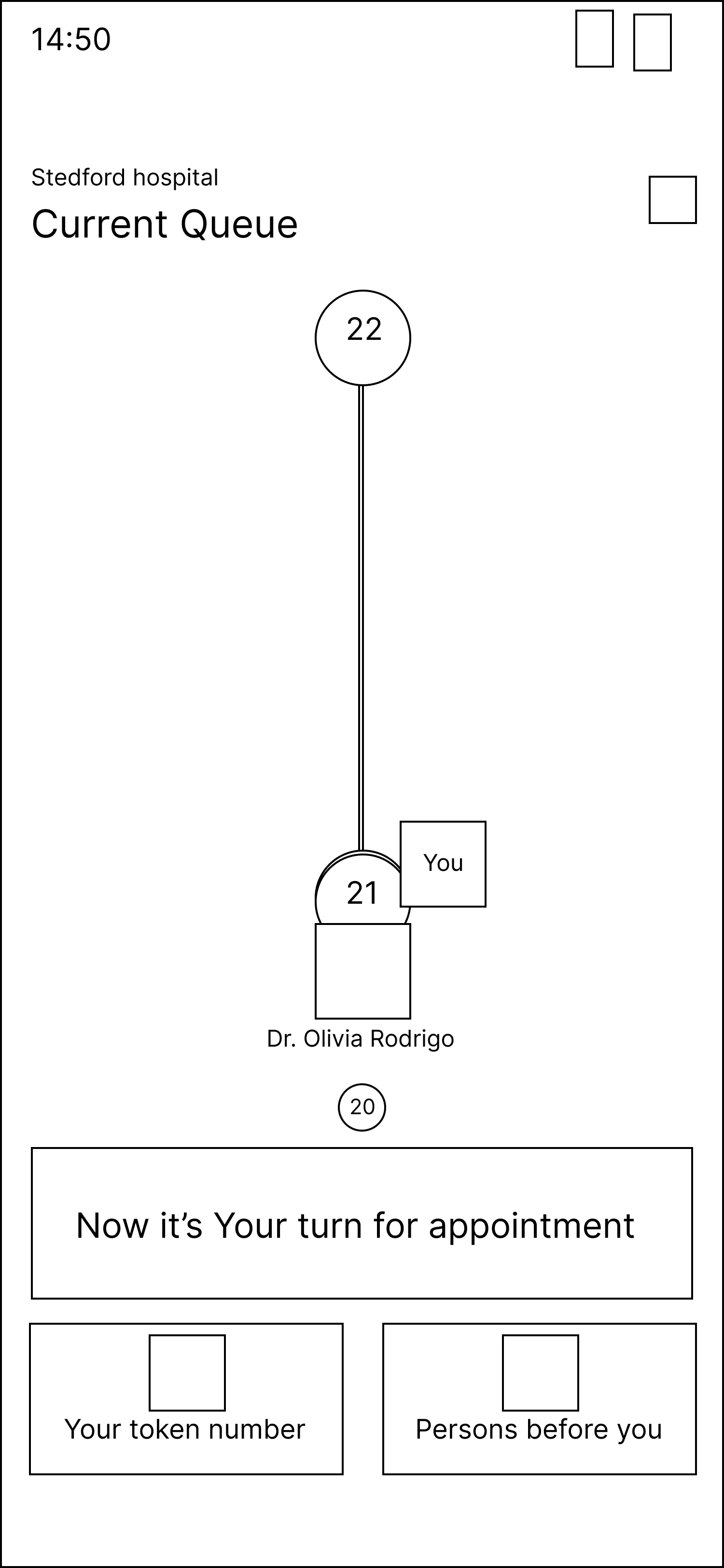
After choosing the most user experienceable design from Crazy 8’s for the live time track and current queue pages, low-fidelity wireframes are created
In order to get feedback on usability and the overall user experience, I conducted testing with a Low-fidelity prototype. The response was overwhelmingly good, only then a few UI modifications weremade.
Testing + Improvements
The Final Product
The Style Guide
CONCLUSIONMy very first UX project is this one. Through this project, I learned a lot about what it's like to work on a UX project, and I am incredibly grateful to have had the opportunity to experience the entire UX process. I feel that this experience will be valuable for me moving forward. Some of the key things I learned include:
Meaningful Movements. I used movements in the queue to involve the users and make them feel like an integral part of the design process. I took users into the design and made the design revolve around them, with this I was also able to create a user-centric experience. I learned that adding meaningful movements can improve usability.
Never skip feedback. One of the most important lessons I learned from this project is the importance of gathering and incorporating user feedback into the design process. With feedback, I was able to make improvements and add new flows to this project which meet the needs and preferences of users.
iteration is truly the mother of invention. I iterated over a period of three weeks at least 7 times. I iterated as much as I can to reach the present design solution. I also learned iterating doesn’t mean I am bad at design but it means I am on my way to a new (invention) design solution.
Final is a myth. I realized that the concept of ‘the final design’ is a myth because the design is never ending process and there is always something to change as time goes on. This approach taught me the value of flexibility and adaptability in the design process and I will be sure to keep this in mind in all my future projects


